Turquoise, a Colour Between Two Worlds
Turquoise can present the painter with a small problem… where exactly does it belong on the palette?
Is it blue? There is too much green in it. Is it green? Something in it remains stubbornly blue. On a colour wheel, of course, we can simply assign it a place somewhere between the two and consider the matter settled. But in front of a canvas, that classification becomes far less interesting. Turquoise is fascinating precisely because it occupies this unstable territory where our perception hesitates. For practical reasons, on the studio palette, it sits at the very end of the row, just after ultramarine.
Place a turquoise among a group of blues and it appears green. Place exactly the same colour among greens and it turns blue. Our perception depends on its context. Turquoise is a colour of relationships. Its nature shifts according to what surrounds it…and that is one of the reasons why it is one of my favourite colours.

Before It Was a Colour, It Was a Stone
The word “turquoise” comes from the stone. Its European history can be traced through the Old French turqueise or turquoise, literally meaning “Turkish stone”, not because the main deposits were necessarily located in Turkey, but because these stones reached Europe through trade routes passing through the Ottoman world. Yet the history of this colour begins long before its European name.
Natural turquoise is a hydrated phosphate of copper and aluminium. Copper is primarily responsible for its colour. Depending on its composition, structure and associated minerals, the stone can range from a relatively pure blue to blue-green, sometimes becoming distinctly greenish.
This fascinating chromatic range already captivated ancient societies. In Egypt, blue and blue-green colours held an important place from an early period in objects, jewellery and decoration. Turquoise from the Sinai was mined in antiquity, while Egyptian craftsmen also developed artificial materials capable of producing extraordinarily luminous blues and blue-greens.

A word of caution: the famous Egyptian blue is not turquoise. It is a copper calcium silicate, closely related to cuprorivaite, produced by heating materials containing, among other things, silica, calcium and copper. It appears from the early dynastic period in Egypt and is considered the earliest known synthetic pigment.
But the Egyptians also produced glassy materials and faience in which copper ions created precisely those brilliant blue-greens that we associate with turquoise today. Research into ancient ceramics and glass shows that turquoise colourations were already being achieved in ancient Egypt by firing silica-rich materials in the presence of copper.
In other words, several millennia before the invention of our paint tubes, humans were already trying to manufacture this elusive colour artificially. And to do so, they needed… fire.
I find that wonderfully paradoxical: a colour we instinctively associate with water was born, in part, from the technology of fire.

From Egypt to the Islamic World
It is in the arts of the Islamic world that turquoise finds one of its most spectacular territories. For a moment, we should almost forget easel painting altogether and look instead at architecture. Turquoise on canvas comes later.
Across domes, architectural ceramics, tiles, mihrabs, mosaics and objects, blue-green becomes a colour capable of covering vast surfaces while retaining an extraordinary luminosity. From Iran to Central Asia, and later in Ottoman production, turquoise is constantly in dialogue with cobalt blue, white, and sometimes red and black… the latter often used for outlines. And within these combinations, we discover just how remarkably well turquoise responds to contrast.
Next to a deep cobalt blue, it appears luminous.
Next to white, it becomes denser.
Next to red, it can become almost electric.
Next to a warm earth colour, it immediately creates an impression of intense light.
Ottoman ceramics and related traditions offer countless examples of this chromatic logic. I took a few photographs in the Louvre’s Department of Islamic Art several years ago, and the large Iznik dish below is a particularly beautiful example of turquoise in action.
It is a remarkable demonstration of chromatic balance. Against the luminous white of the ceramic body, powerful turquoise rosettes seem to float among extraordinarily delicate stems, cobalt-blue leaves and touches of aubergine-brown. Turquoise plays an essential role here: introduced into the Iznik palette alongside cobalt, it became one of its most brilliant signatures during the sixteenth century. The Louvre preserves Iznik decoration explicitly combining turquoise and cobalt from as early as the 1530s.
For me, this is much more than simply a “beautiful Oriental colour”. It is a genuine lesson in contrast… and, above all, an extraordinary field of experimentation for the painter.

Turquoise Does Not Exist
I like to say that turquoise does not exist. Put several tubes labelled “turquoise” from different manufacturers side by side and you will quickly discover that they are all different… every single one of them!
This is essential to understand: “turquoise” is not the name of a specific pigment. It is the name of a colour.
One manufacturer may create its turquoise using a cobalt pigment. Another may use phthalocyanines. A third may simply mix blue, green and white. So the name printed on the front of the tube tells us far less than the small pigment codes printed on the back.
PG50, PB36, PB15, PG7, PB16, PW6.
Two Almost Opposite Families
For the contemporary painter, there are roughly two main ways of arriving at turquoise. The first is through cobalt turquoises. The second is through phthalocyanine turquoises. Visually, they may belong to the same family. Pictorially, they behave almost like two different species!
Take a genuine Cobalt Turquoise Light PG50… the one I prefer in the studio. Winsor & Newton, for example, offers a PG50 in oils that is opaque, extremely permanent and has excellent lightfastness. The sensation is immediately mineral. The colour has body. It covers. It sits naturally within the lights. Mixed with white, it retains a certain material presence. It can produce those pale, slightly milky blue-greens we sometimes find in ceramics, sunlit water or cool light. It can also be used to warm up skies and, above all, to produce electric greens when mixed with cadmium yellow.
Now let us look at a phthalo turquoise. Golden’s Turquoise (Phthalo) is made from PB15:3, a green-shade phthalocyanine blue, and PG7, phthalocyanine green. The mixture is transparent and has an extremely high tinting strength. We are in a completely different world.
Cobalt turquoise readily gives you substance; phthalo gives you depth. The first can inhabit an opaque light. The second can shine through a layer like stained glass.
The Phthalo Trap!
You have been warned :-) Phthalocyanines are magnificent… but dangerous. Not necessarily in the toxicological sense: dangerous for your paintings. A tiny amount of phthalo blue or green can take control of an entire mixture. You want to cool an shadow slightly. You add some phthalo. A little more. And suddenly the whole painting looks as though it has sunk to the bottom of a municipal swimming pool.
The extraordinary tinting strength of these pigments forces us to work differently. You do not necessarily pick up phthalo with your brush as you would a raw umber. You can simply touch the colour, then introduce that trace into the mixture. With phthalos, quantity itself becomes a pictorial decision.
Golden describes its Phthalo Turquoise as a transparent colour with very high tinting strength; its formulation combines PG7 and PB15:3. If you want a transparent turquoise, it is extraordinary. In a glaze, these pigments can produce blue-green depths that are almost impossible to achieve with an opaque mineral pigment.
Anyway… you have been warned.
Mixing Your Own Turquoise
There is obviously no need to buy a tube with the word “turquoise” printed on it. You can build the colour yourself.
The most obvious solution is to mix a green-shade blue with a green. Phthalo Blue PB15:3 mixed with Phthalo Green PG7 produces an extremely intense turquoise. But straight from the mixture, the result is often too saturated for figurative painting.
Add titanium white and you obtain a spectacular pale turquoise… and a fairly opaque one. But it can sometimes look like plastic.
So you need to “dirty” it.
Dirtying Turquoise
I like using the expression “dirty the colour” in the studio, and for good reason. It does not mean destroying the colour. It means giving it complexity.
Try adding the tiniest touch of burnt sienna to your turquoise. Very little. The mixture immediately loses its industrial quality. With umber, it becomes deeper. With yellow ochre, it becomes earthier. With alizarin crimson, it can shift towards a coloured grey of extraordinary richness.
To make a highly saturated colour believable in a naturalistic painting, it is often far more interesting to reduce its saturation slightly than simply to make it darker.
Turquoise in Flesh Tones
Here is a much less obvious use: turquoise can enter into the painting of flesh.
Not as a visible colour, but as a correction.
In certain warm complexions, particularly when the lights tend towards orange, a microscopic amount of blue-green introduced into the halftones can create a remarkable vibration. Why? Because we are approaching a complementary opposition. The red-oranges of the skin encounter their blue-green counterweight.
The point is absolutely not to paint a turquoise stripe across someone’s face :-) The colour must disappear into the mixture.
I like to use Rubens’s flesh tones as an example. Even though his actual working method was different, we can use turquoise to arrive at similar nuances of desaturated flesh.
Turquoise changes the mixture. It can cool a temple or push a plane further back. It can make a cheek recede into shadow. It can neutralise an orange that has become too dominant. It can create that circulation between warmth and coolness that prevents flesh from becoming uniformly salmon-coloured.
Here, turquoise is no longer really a colour.
It becomes… an adjustment.

Turquoise and Light
There is another reason why turquoise is such an interesting colour in painting: it can create the impression of light without actually being particularly light in value.
It is something painters understand intuitively. A saturated colour can appear luminous when surrounded by more neutral colours. Imagine a painting dominated by earth tones: umber, ochre, reddish brown, black, warm grey. Now place a small area of relatively pure turquoise in the middle of it… It lights up.
Not because its value is necessarily very high, but because everything around it has prepared our eye to receive that sudden burst of saturation.
This is precisely why architecture covered in blue-green ceramics can appear so dazzling under warm light. The contrast is not simply light against dark. It is warm against cool. Saturated against muted. Blue-green against ochre.
Colour becomes light through relationship!
Turquoise and Water
When speaking about turquoise, it would be tempting to immediately call it the colour of the Mediterranean. That would be the wrong lesson.
If we look at what the great painters of water, Sorolla in particular, can teach us, we realise that water does not have a single colour. It receives the sky, reflects what lies beneath it, absorbs certain wavelengths of light, and mirrors bodies, sails, sand and shadows. Within a single stretch of sea, blue, green, violet, grey, ochre and almost pure white can all coexist.
And turquoise works precisely when the painter allows it to become part of this constant circulation of colour.

Used on its own to say “sea”, turquoise quickly becomes a convention. Used as a transition between several colour families, it comes alive.
This is a rule we could apply to almost every colour: never confuse the name of a colour with the name of a thing.
The sky is not blue. Grass is not green. Skin is not pink.The sea is not turquoise.
These are precisely the shortcuts that learning to paint must destroy in the studio.
Even the whites of the eyes are never white.
An Accelerator of the Orient
I am an Orientalist painter, and there is a specific issue here that I find particularly interesting. Turquoise carries an enormous amount of cultural meaning.
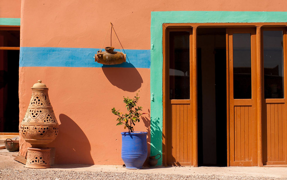
A fragment of turquoise zellige, an ochre wall, a white djellaba and a cobalt shadow: within just a few square centimetres, the viewer is already somewhere else.
That evocative power is extraordinary… but it is also dangerous. Because a colour can become a cliché.
If turquoise is used simply to signify “Morocco”, “the Orient” or “the Mediterranean”, it no longer serves the painting. It serves the imagery. And the difference is considerable.
Look at a turquoise ceramic object in a dark room and you will see that it is almost never uniformly turquoise. In the light, some areas may become extremely pale, almost chalky. In the halftones, the saturation emerges. In the shadows, the colour may shift towards deep blue, dark green or grey. Specular highlights may be almost white.
A single ceramic object therefore already contains several turquoises.
To paint that object properly means temporarily forgetting that it is turquoise. It means looking beyond the simplification of its colour name and observing what is actually there, introducing nuances that might range all the way from ultramarine to umber.
An Experiment to Try in the Studio
Take a single turquoise mixture, our studio cobalt turquoise, almost straight from the tube.
Prepare five small grounds: white, neutral grey, ultramarine blue, burnt sienna and oxide red.
Place exactly the same turquoise brushstroke on each one, then look carefully.
Against blue, it will appear greener.
Against the warm earth colour, it will appear much bluer and much more luminous.
Against red, its intensity will increase dramatically.
Against grey, its saturation will become obvious.
Against white, it will appear darker than you expected.
And yet you have not changed the mixture at all!
The environment has changed the colour.
This simple experiment teaches you more about turquoise in a few minutes than memorising dozens of mixing recipes. More importantly, it teaches you that a colour never exists alone.
A Few Examples
I cannot finish this article without looking at a few examples of turquoise in the work of the masters.
The first that comes to mind is Modigliani and one of his portraits of Elvira, reproduced above. The Tate’s most recent technical study of the painting identified the extensive use of cobalt chromite blue-green (PB36) throughout the background.

For my second example, I chose Henri Matisse. I am writing this article just after visiting the Musée Matisse in Nice, so naturally my head is still full of colour!
In Open Window, Collioure, his blue-greens are caught between fuchsia, pink, cranberry red and orange. The entire chromatic system is intensely saturated, and it already gives us an extraordinarily effective formula : turquoise + coral/orange + pink-fuchsia
This is a powerful combination to study if we want turquoise to become more than merely decorative.
There are, of course, countless other examples, in the work of Nolde, Hockney, Milton Avery and many others, but this article is already long enough! If you would like to see more, just ask me at the studio and I will be very happy to show you.

A Colour Between Two Worlds
I like to think that turquoise refuses to choose a side.
It exists somewhere between blue and green. Between water and mineral. Between transparency and opacity, depending on the pigment that produces it. Between a cool colour and an almost warm one as it moves closer to green. Between natural stone and the artificial materials humans have been creating since antiquity. And this instability is precisely what we, as painters, can exploit.
I also like the idea that the most interesting colours often begin at the very moment when their names are no longer enough.
A grey with a hint of violet.A brown running into green.A black that turns blue.Flesh containing green… And that blue which, after looking towards green for long enough, eventually becomes something else.
You will find turquoise in many forms at the studio, oil, acrylic, watercolour, soft pastel, Posca, pure cobalt turquoise pigment, and more. In one form or another, it almost always finds its way onto our palettes.
If you have any questions about the ideas explored in this article, feel free to discuss them with me at the studio or send me an email.
See you very soon at the atelier,


Comments